
STENS // case study
Built off the rich brand history, the next evolution of Stens focuses on the expansive product selection and symbolism behind the hex shape.
SIMPLIFIES
Less is more.
Brand simplification is aimed at developing a resonating message to our customers by eliminating the clutter. Reducing the color palette increases customer recognition. Concentrating on the blue Stens’ color, the brand is presented as dependable, strong, and confident.
DEFINES
We focus on the essentials.
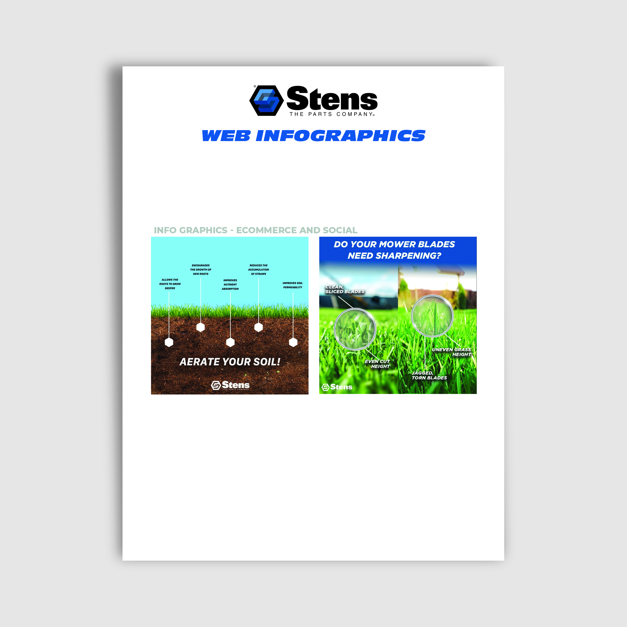
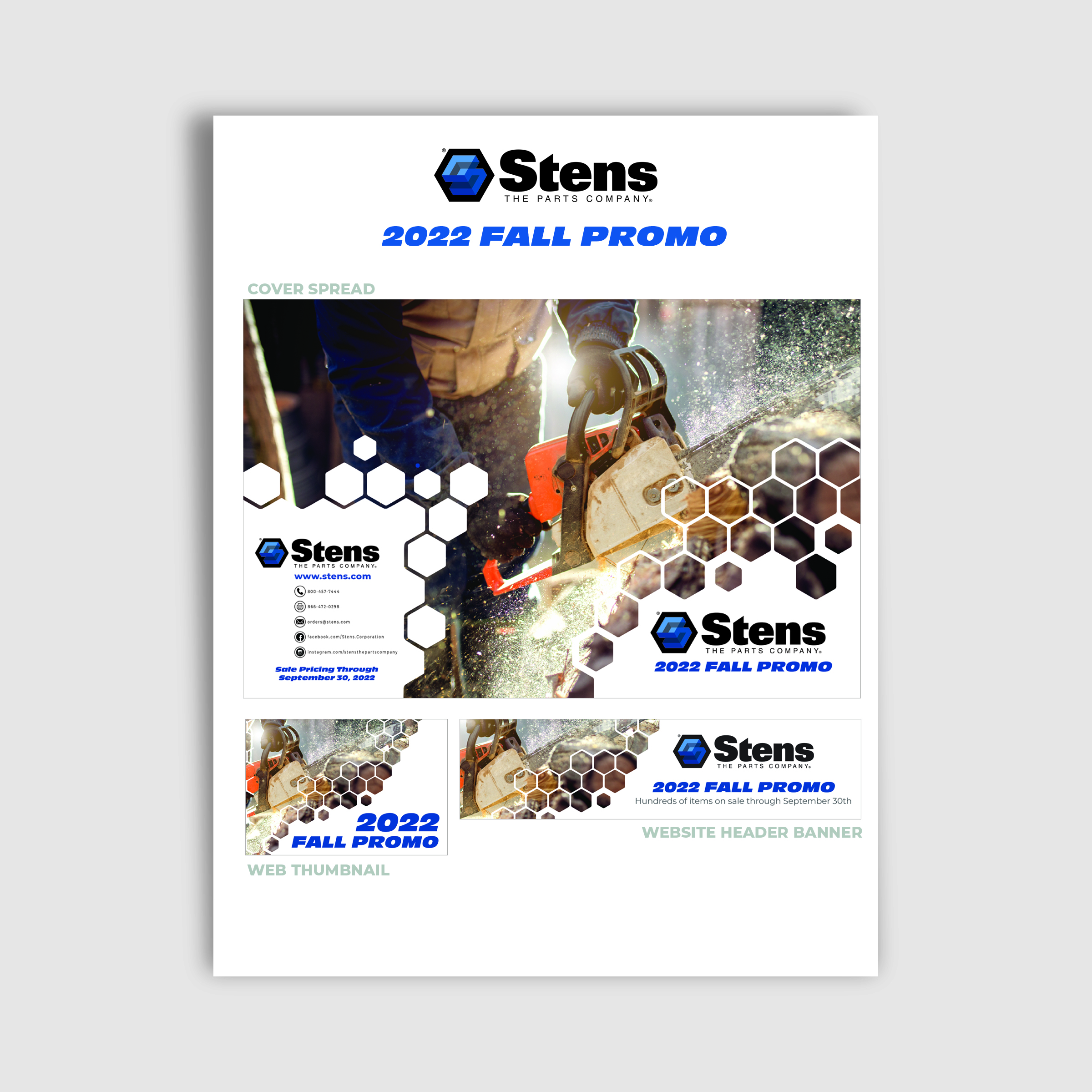
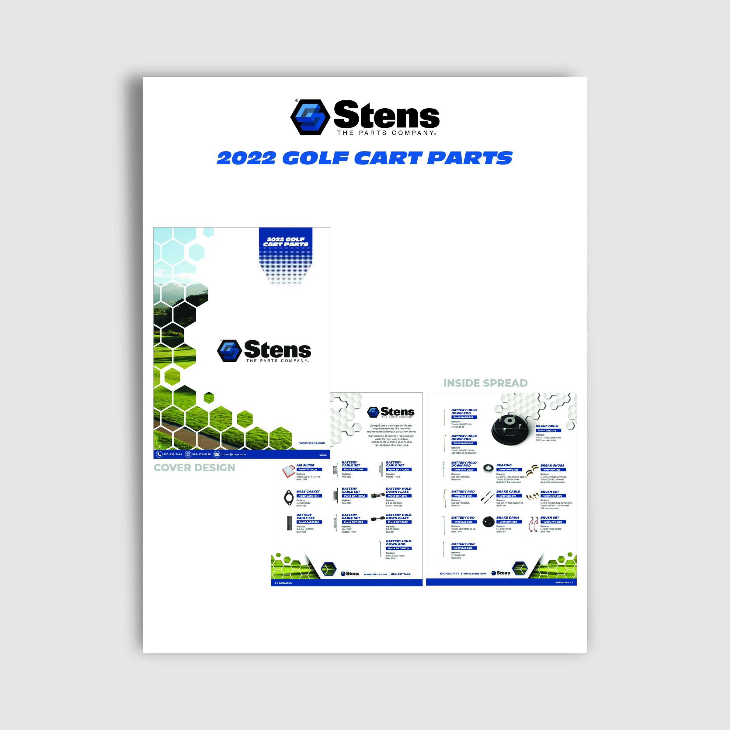
Stens is adaptable, it is growing, and it won’t abandon its roots. The hex shape becomes a prominent tool in our marketing collateral. The Stens hexagon is used to symbolize efficient selling solutions, emphasize market strength, and highlight product offering expansion.
MODERNIZES
Subtle changes; big waves.
Brand modernization demonstrates Stens’ commitment to constantly evaluating trends while bringing innovation to the industry. Converting to the single-color palette focus adds depth to the brand without adding new features to the design. Utilizing the existing logo revitalizes the brand’s look while keeping the legacy intact.


brand
Stens
marketing team
Chera Gibb – CMO
Jeff Wilson – Creative Director
Emily Gorg – Channel Marketing
Oriana Labor – Senior Designer
Micah Thompson – Senior Designer
Jeff Shafer – Graphic Designer
media
digital, print, video, tradeshows,
social, packaging, and web
dates
August 2022 – January 2023
