
packaging case study /// trilink retail program
TRILINK
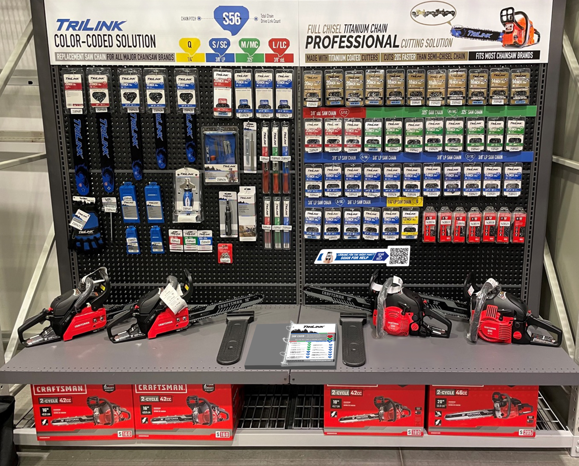
Expanding on the Lowes account management case study, the newest evolution of TriLink was developed in 2019 strategically to gain placement in Lowes retail stores. That was just the kick-off point for the new packaging solution, however, as the full line was built with a selling solution to support all retail markets and customers.
market:
Outdoor Power
Chainsaw Accessories
retail chains:
Lowes
TSC Canada
Mid-States Group
initial launch:
2019
CONSUMER PROMINENCE
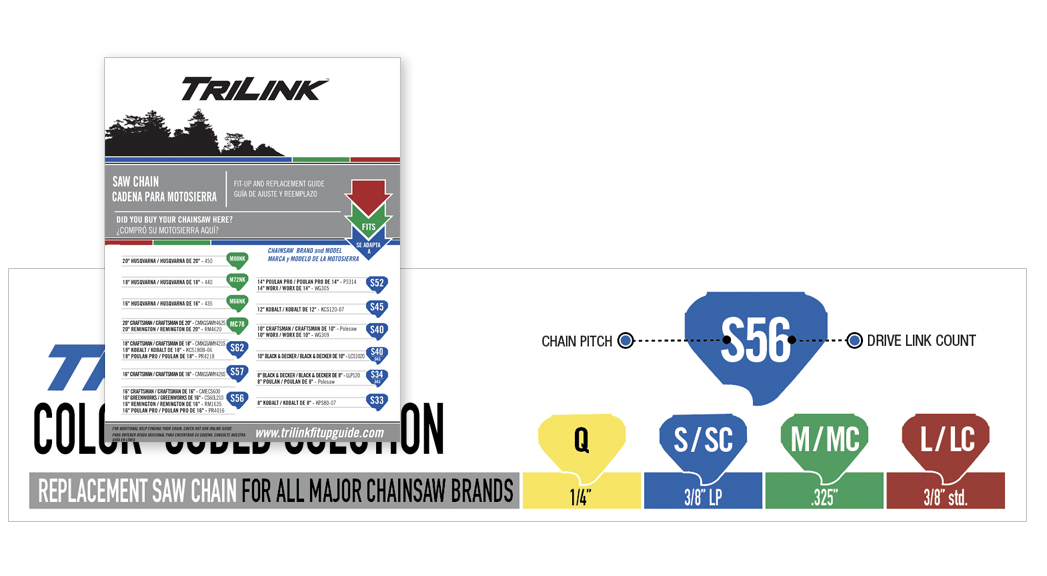
Drawing attention to the product on the shelf isn’t the only aspect of visibility considered with the new design. We want to deliver information to the customer quickly, clearly, and concisely. High contrast and large, bold product specifications callouts put the needed information in front of the customer. The color coding organizes the store set selection into shopping segments. The alpha-numeric drive link icons simplify the end consumer’s replacement part search.
SIMPLIFIED SELLING SOLUTIONS
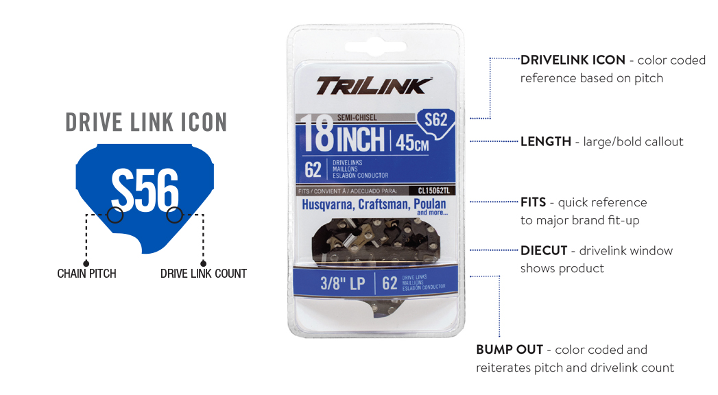
Through extensive marketing studies, finding the correct replacement part is the consumer’s number one concern. All our efforts are built to ensure the end consumer leaves with the correct part the first time and looks to make each follow-up visit quicker and easier. In addition to showcasing prominent brands each replacement chain fits, we incorporate an alpha-numeric icon identifier on all chains and guide bars. The alpha character represents the chainsaw pitch and corresponds with the icon and packaging color, while the number is the chain’s drive link count, making each icon unique to the replacement part.
VISUAL RESONANCE
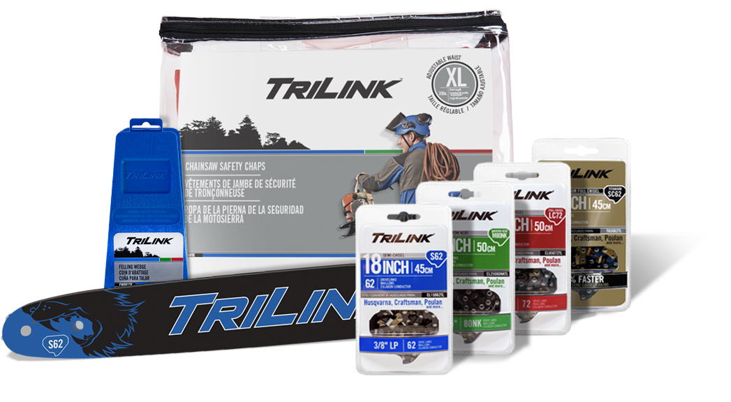
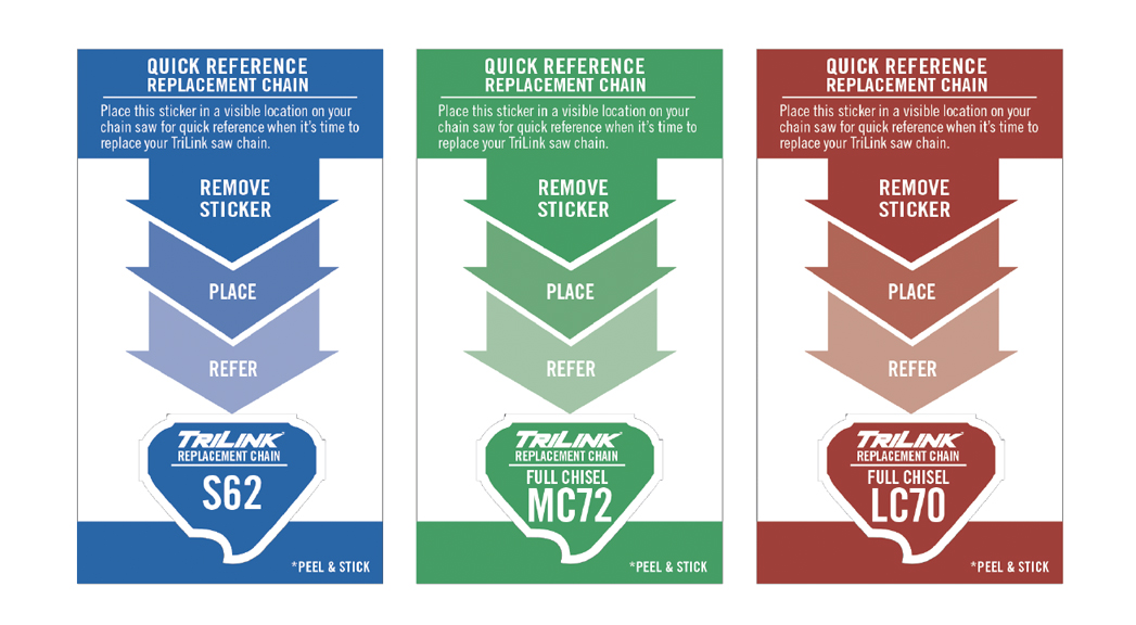
Coinciding with the drive links icons, our color coding creates a quick visual connection narrowing the search for the consumer. Each color is specific to the chain pitch, the alpha portion of the drive link icon. Building a visual resonance, through the drive link usage, each chain loop package includes a drive link icon sticker. Peeled and adhered to their chainsaw, the drive link sticker is a guess-free solution when replacing their chain.
BUILDING CUSTOMER LOYALTY
We work closely with our retail partners to showcase the drive link icons on point-of-purchase signage including the price tags of OEM chainsaws to highlight that machine’s correct replacement part. Additionally, we developed in-store fit-up guides listing every chainsaw brand and model and the icon for their correct replacement chain. The fit-up guide includes a quick reference page that lists all chainsaws sold at that specific retail store and showcases the correct replacement chain icon. Our selling solutions bring the end consumer back to our correct parts and back into our retail partner stores with the assurance they’ll leave happy.
CORRESPONDING CATALYST
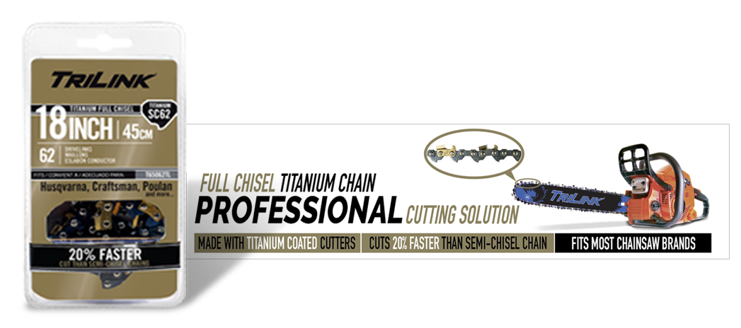
The TriLink Titanium chain cutters are finished with a chrome and titanium coating resulting in a gold-bronze coloring that stands out compared to the rest of the dark steel chain components. The newer metallic Pantone inks provided a perfect solution to highlight the finish of the titanium cutters in the packaging. The full metallic ink coverage also served as a distinct catalyst to the minimalist approach throughout the rest of the product line bringing added visibility and awareness to these higher-performing, specialty chains.

STANDING OUT IN A STALE INDUSTRY
Looking across the chainsaw industry chainsaw guide bars (blades) are traditionally simplistic, solid gray, occasionally black, and have a single-color logo. With the launch of our new branding, we also developed a new painting process that opened the opportunity to utilize the blade surface for intricate designs. Adding animal teeth, to the nose of the bar, ripping through the wood instantly had the TriLink bars standing out on the shelves. The drive link icon was incorporated into the design as well for quick customer reference when needing to replace their chain.